|
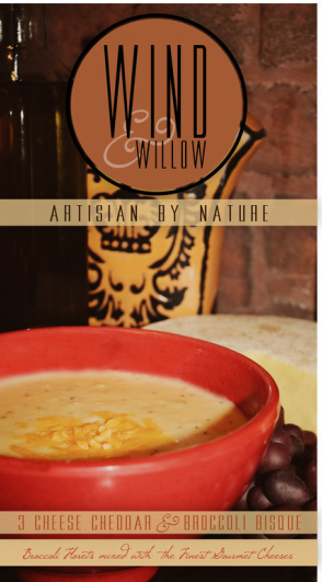
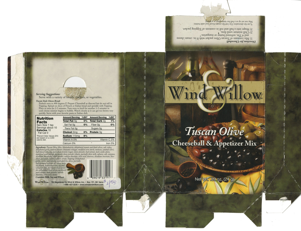
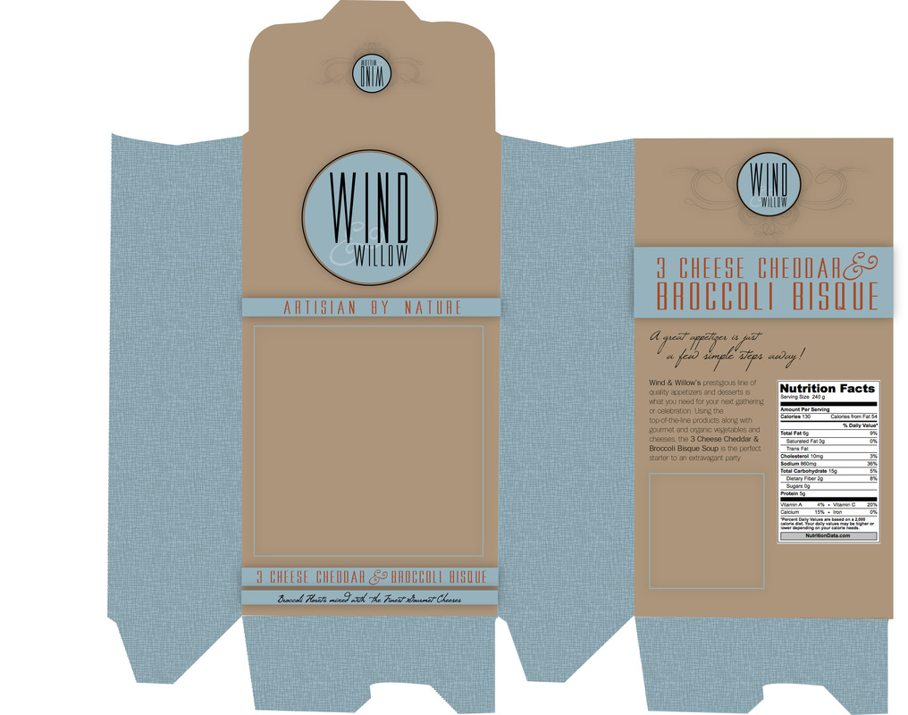
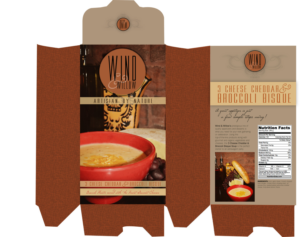
During the last few weeks in my Practical Advertising class we have been working on a logo for the appetizer company, Wind & Willow. After learning about the seven different types of logos (which will be discussed in a later blog entry) we were to come up with the packaging mechanical for a Wind & Willow appetizer. For mine, I chose a 3 Cheddar Cheese & Broccoli Bisque soup. THE CHALLENGE: Cater to the 21st century party planning housewife in her mid thirties by redesigning the packaging as well as creating and updated logo. THE SOLUTION: By catering to the 21st century party planning housewife, I had to update the muted colors while still maintaining a classic and conservative, but still playful, packaging. For the logo, I used both a sans serif and script font to give it a much needed updated and modern look to it, as seen below. * Feel free to click on the photo to enlarge it in a different window. Please leave comments letting me know what you think about the final solution. |
Archive
October 2018
|


 RSS Feed
